Here’s how we helped Healing Hearts Connection realign with their audience.
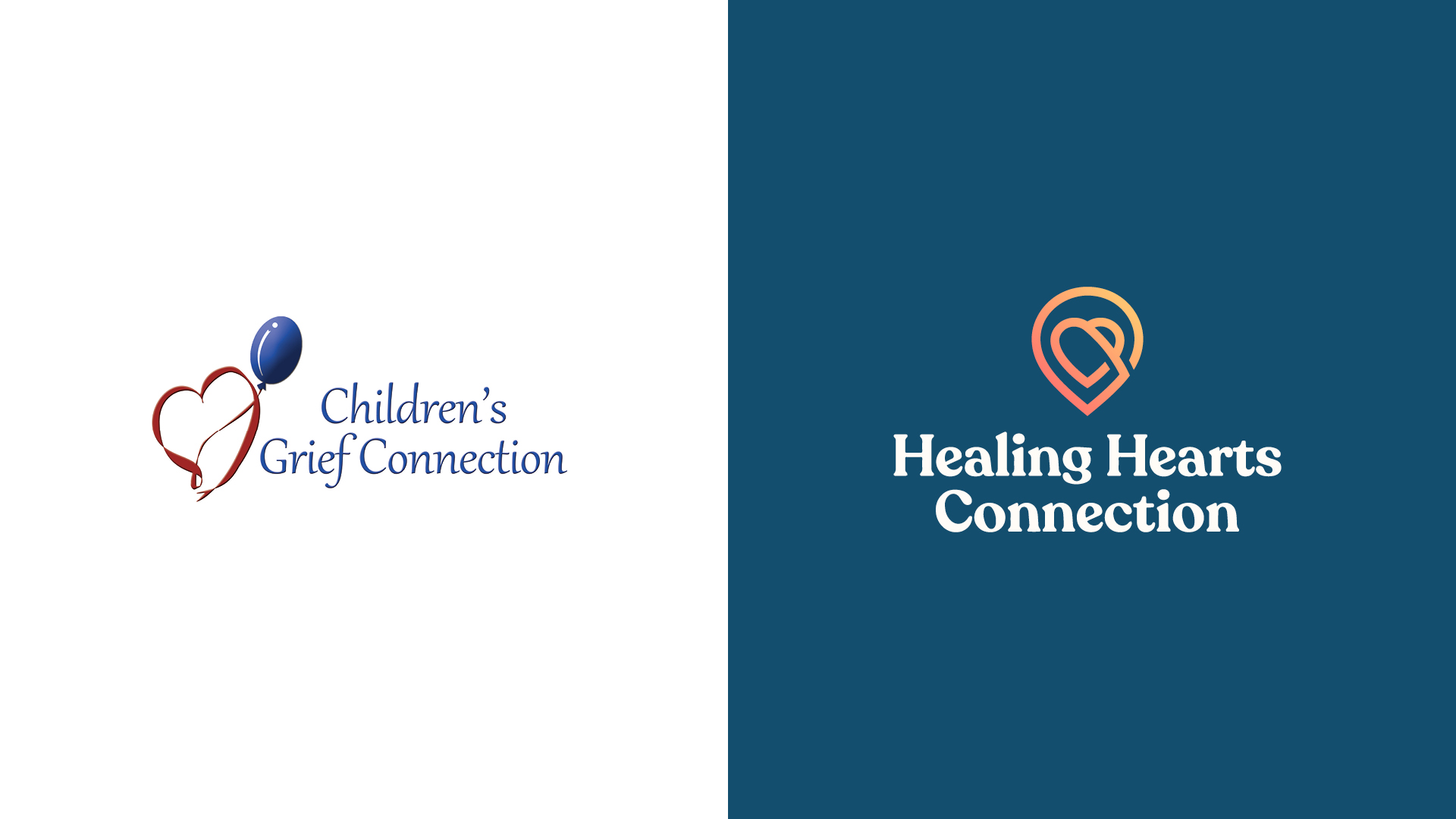
Formerly called Children’s Grief Connection, Healing Hearts Connection is a Minnesota-based organization dedicated to providing support and community for families who have experienced the loss of a loved one. Through the program, people come together for grief camp twice a year. An opportunity to meet and connect with others in similar situations, be vulnerable in a safe space and ignite a sense of hope for the future, grief camp is both unifying and uplifting.
Since the first camp in 2003, interest has spread throughout the state and beyond, leading Children’s Grief Connection to grow tremendously. Naturally, it also became time for a rebrand that better aligned with the growing brand and its group of camp participants.
“The organization felt the name was no longer applicable to the wider audience they wanted to reach,” explains Zach Spanton, Senior Digital Art Director at Russell Herder. “An emerging adult between the ages of 18 and 24 wouldn’t necessarily read ‘Children’s Grief Connection’ and think it’s intended for them, but the camps do cater to that audience as well.”
The goal of the rebrand process was to provide a new name and visual appearance that would not only match the vision of the organization, but also become a strong identity they could continue to use as they grow in the future. In order to achieve this, our design team took an incremental approach to the creative transformation, making sure the client had a chance to voice ideas and approve directions before taking them.
To fully understand the mission and vision for Children’s Grief Connection, Russell Herder began by getting to know the organization and board members as part of our B Corp commitment to meaningful nonprofits. With this foundational information, we then wrote a brand positioning statement, detailing the Children’s Grief Connection identity and who they strive to become in the future. During each step of the creative process, the statement served as a resource and roadmap guiding the work that followed. This entailed the development of new name options that spoke to the purpose of the organization, as well as exploring different visual directions to take.
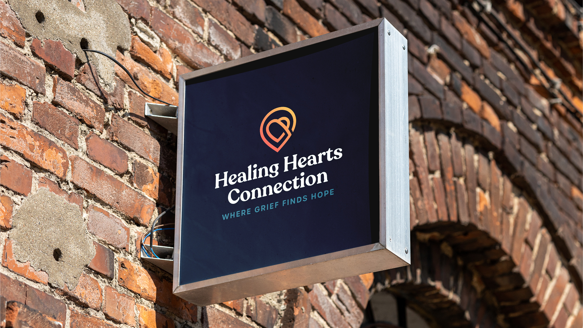
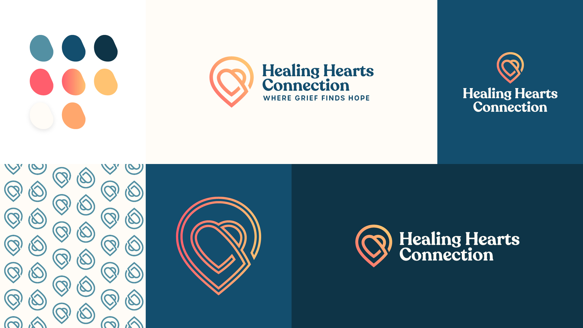
After a final name and visual identity were chosen, we created the logo, meant to embrace both the organization’s roots and future, as well as brand elements. “The icon resembles the balloon and heart ribbon from the original logo, but it also represents a damaged heart that is being healed as well as a map pin,” says Zach. “This ties to the newly created tagline ‘Where Grief Finds Hope.’”
Colors used in logos and branding also play a role in tone that can’t be overlooked. For this organization, soothing navy blue and cream-colored backgrounds create a calming look, while bright pops of orange represent the hope that can be found through attending camp and taking part in other community groups through the organization. The result is both eye-catching and true to the vision of Healing Hearts Connection.
“As a small non-profit, this gift was priceless,” says Jessica Moujouros, Executive Director at Healing Hearts Connection. “The team was easy to work with and professional, and we feel they deeply understood our vision and truly got what we are all about. They delivered beyond our expectations and our entire organization has embraced our new look.”
“Our experience was nothing short of collaborative excellence!” adds Roger Matza, President of the Board of Directors at Healing Hearts Connection. “We found the process from ‘discovery, developing our strategy, to branding the final product’ to be best in class. They achieve this through their highly gifted and dedicated team members who instill confidence, professionalism and heart. They have become our marketing partner of choice.”
With the new name and visual branding, Healing Hearts Connection is equipped to continue sharing their message of hope while expanding their reach.