Creating an effective logo is key to representing an apartment community well. See the strategy we took for three Timberland Partners’ properties.
It’s no secret that a well-executed logo makes a difference. Because they’re meant to last for years while capturing attention and making an impact, it’s crucial to carefully weigh different options. Selecting a final choice that closely represents your brand while speaking to your audience with bold, striking visuals is the key to landing on a timeless design.
Through our work with Timberland Partners, we’ve had the opportunity to create logos for several of their apartment communities located throughout the country. During our design process, we created each option to have a cohesive brand look, tying the properties together as part of the real estate investment company’s unified collection while also having their own distinguished identity. Representing each unique community with accuracy and appeal are a key part of the process.
![]()
Thrive Luxury Apartments in Davenport, Florida
As we started the creative process, our client wanted to celebrate the property’s beautiful surroundings with a visual that would stand out from generic apartment branding. Since this apartment community is situated in a suburb outside Orlando, we found it fitting to feature a palm tree placed along the horizon as part of the design, integrated with sleek typography.
![]()
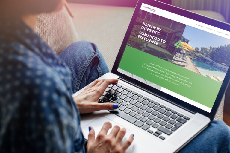
The Aria at Woodlands South in Tulsa, Oklahoma
With a bright yellow wheel nodding to the windmills characteristic of the geographic region, this logo is both playful and sophisticated. The clean and modern alternating stoke widths suggest refinement, while the spiraling letter “A” in the windmill creates a signature design that’s true to the apartment name: Aria. Colors were carefully selected to integrate with the look of the property while simultaneously capturing interest.
![]()
Villas at Park Avenue in Pooler, Georgia
With a warm, beachy atmosphere, this logo reflects the property’s coastal feel through understanded waves between the text. This design maintains strong name legibility for instant recognition that makes a statement across different mediums, as well as on property signage. By weaving the wave design in with the text, the name becomes associated with the sea, making its identity as a luxury coastal living destination quickly become clear.
From representing an apartment community’s attributes to clean, quickly-identifiable visual appeal, creating an impactful logo requires in-depth consideration. The end result for these three examples effectively balances multiple priorities, giving these apartment communities a strong visual identity and immediate recognition that will last for years to come — just a few of the advantages of bold, timeless branding.